
Case Study
From Borders to Belonging
Background/Context
The Rainbow Coalition for Refuge is a coalition of Canada-based organization who champion LGBTQI refugee protection and settlement. Together, they connect like-minded organization to advance work that support LGBTQI Settlement, engage with and build capacity among groups who provide supportive communities of arrival, and produce and translate knowledge to build capacity, advance research and develop policy that supports the rights and dignity of LGBTQI refugees in Canada.
The coalition strives to operate from a place of respect for Indigenous peoples and is committed to ongoing dialogue that honours principles of reconciliation, honour and centre the lived experiences of LGBTQI refugees, and work from intersectional frameworks to identify and dismantle additional barriers to safety, while remaining true to grassroots forms of organizing, including a deep commitment to community accountability, mutual care, relationship-building; in ways that are responsive, strategic, proactive, transformative and unapologetic.
There are four interconnected areas around which members work: overseas protections, settlement, in-land protection for migrants and asylum-seekers, and integration here in Canada.
Client
From Borders to Belonging
Types of Work
Branding, Copywriting, Facilitation, Research, Strategy, Graphic Design, Web & Digital
Year
2020-2022
The Need
Rainbow Coalition for Refuge’s existing name was derived from a short process, and the group partnered with The Public in 2020 to lead a more fulsome naming and re-branding process that would bring them to a more intentional place. Our goals were to:
- design a process that honoured the strong basis of unity among coalition members
- propose a name and brand that bridges difference between primary audiences (Canadian LGBTQI settlement organizations, Canadian government, UNHCR, International governments) and audiences of accountability (LGBTQI refugees, frontline workers, member organizations, LGBTQIA-mandated organizations, sponsor groups)
The Process
Understanding that the first time around, naming and branding was rushed, we designed a process that would work at the pace of care and trust of founding coalition members. We could see and feel how much brilliance and creativity this group held, and proposed a workshop-based hybrid process that brought together the best of community- and client-centred design practices.
Building understanding: the creative brief
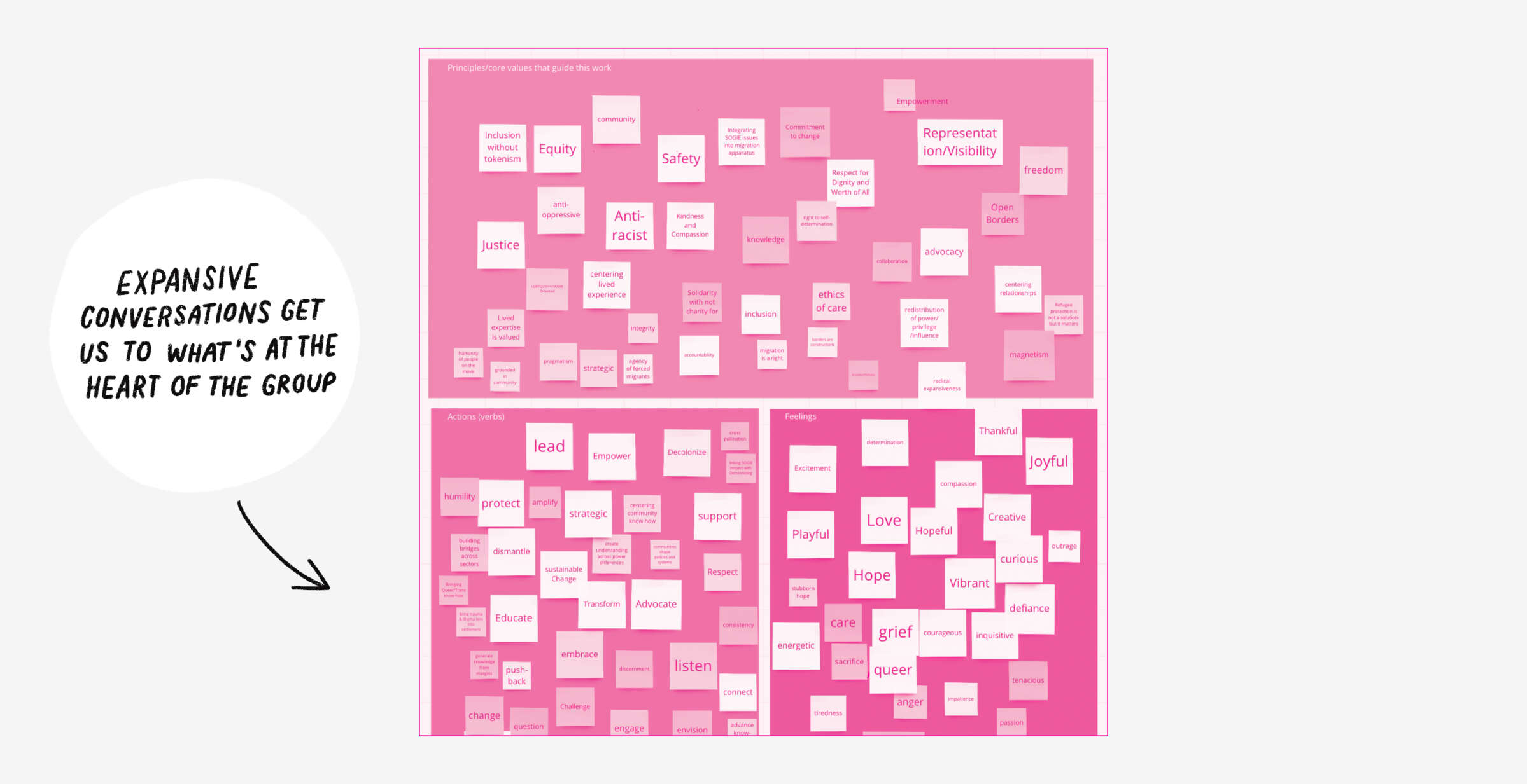
We started our process with a creative brief. The formal work, or “what,” of the Rainbow Coalition for Refuge, written out for us in proposals, policy recommendations and previous calls for members, started to tell a story of an active and committed coalition with the know-how to fully advocacy for LGBTQI refugees. The other part of the story—the “who,” “how,” “why,” “from what principles,” and, “to what end?” was what we focused on here.
We find that briefs provide more valuable insights when they are de-structured and have more space for abundant and expansive conversations. Rather than focusing on the traditional set of questions, eg. “what are your key messages?” we focused on three core questions:
- On what core or guiding principles is the coalition built?
- What actions are central to this work?
- How do coalition members feel in Rainbow Coalition for Refuge activities and spaces?
The nuanced conversations that followed lead us to develop a thorough and nuanced creative brief that would guide our work.
Building a framework
From the brief, and our own research, we proposed three different directions for the overall framing of the coalition. The idea is that a selected framing would then inform a direction for a new name, and the visual materials to follow. The first presented option focused on the idea of boundlessness, emphasizing and leaning not the messy edges of this work: between protection and settlement, between settlement and community-building, and between the many things that our whole selves need, not just to survive, but to thrive.
The second option focused on the idea of safety and dignity. In it, we proposed leaning into a more complex understanding of safety, one that speaks to personal and primary understandings of safety, as well as broader structures of political safety and safety of the whole self.
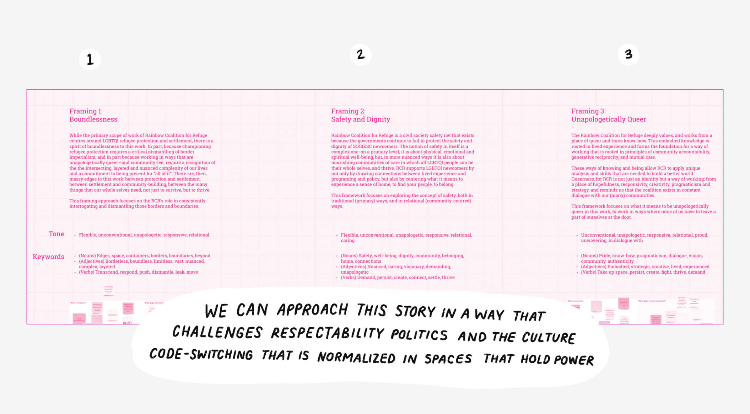
The third option was where the group landed, and focused on the very specific ways in which the coalition operates:
Unapologetically Queer
The Rainbow Coalition for Refuge deeply values, and works from a place of queer and trans know-how. This embodied knowledge is rooted in SOGIESC refugee lived experience and forms the foundation for a way of working that is grounded in principles of community accountability, generative reciprocity, and mutual care.
These ways of knowing and being allow RCR to apply unique analysis and skills that are needed to build a better world. Queerness, for RCR is not just an identity but a way of working: from a place of hopefulness, boundlessness, responsivity, creativity, pragmaticism and strategy, and reminds us that the coalition exists in constant dialogue with our (many) communities. This work may begin with SOGIESC refugee advocacy, support and settlement, but strives, always, for belonging.
This framework focuses on what it means to be unapologetically queer in this work, to work in ways where none of us have to leave a part of ourselves at the door.
The group shared that they appreciate being able to name their queerness not just as an identity, but as a valuable asset, a way of working, being, seeing the world. That it is not a deficit, but a critical lens and analysis that they offer and value and forefront.
In our words
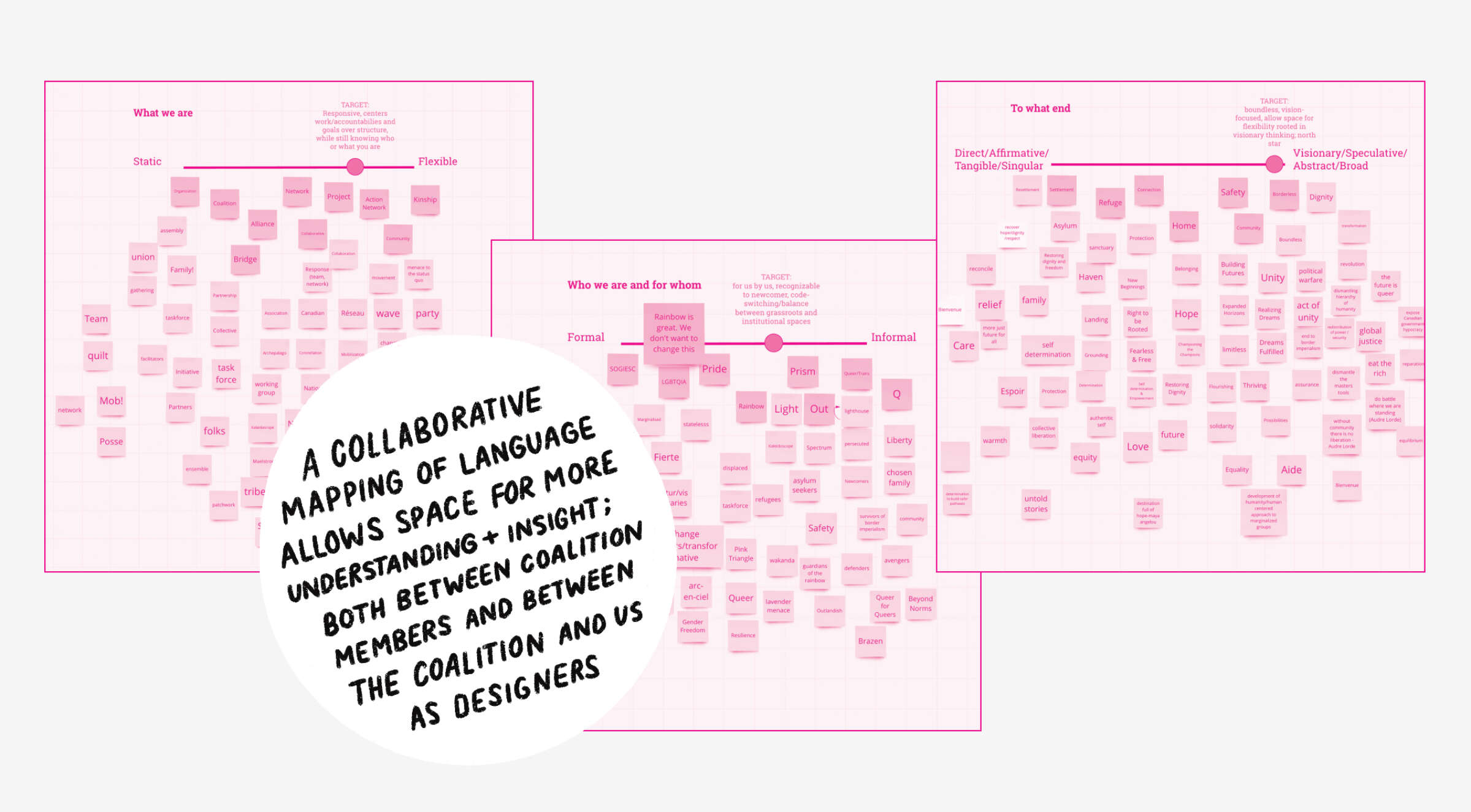
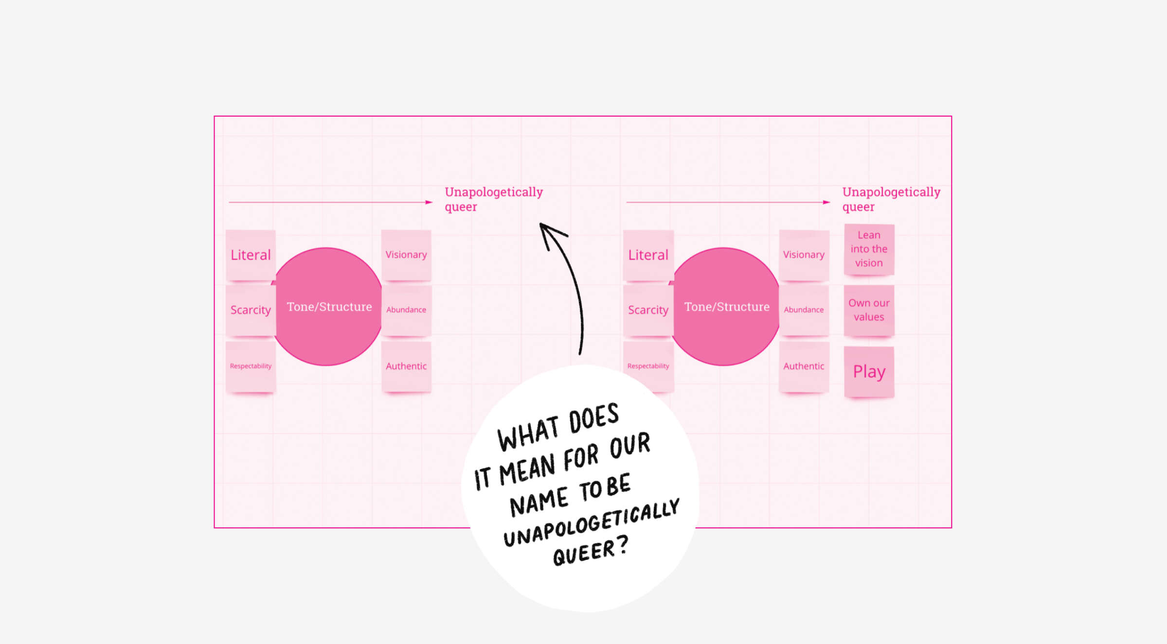
Acknowledging the creativity in the room, we decided to hold a generative workshop to map some language that could support a new name. We took the current name, Rainbow Coalition for Refuge and broke it down into its three components: what we are (eg. a coalition), who we are and for whom (eg. “rainbow” as shorthand for LGBTQ people), and to what end (eg. refuge). Going back to the creative framing, Unapologetically Queer, we mapped each of these along different axes (static → flexible, formal → informal, direct → visionary, respectively). Then, we played. In virtual breakout rooms, members of the coalition generated words on words on words. As in any good brainstorm, the purpose wasn’t to land on the name (at least, not right now!), but rather to build a shared understand of the radical potential of language.
A pause
A commitment to working at the pace of trust and care requires us to have an attunement to points of hesitation or subtle discord in the group. During our creative activity, we noticed that there were some members of the group calling for a radical re-imagination of the name, while others were sitting with more uncertainty. Rather than steamrolling or rushing a process of moving past this discomfort, we decided to lean into it and position it within the context of our selected framing, our shared basis of unity.
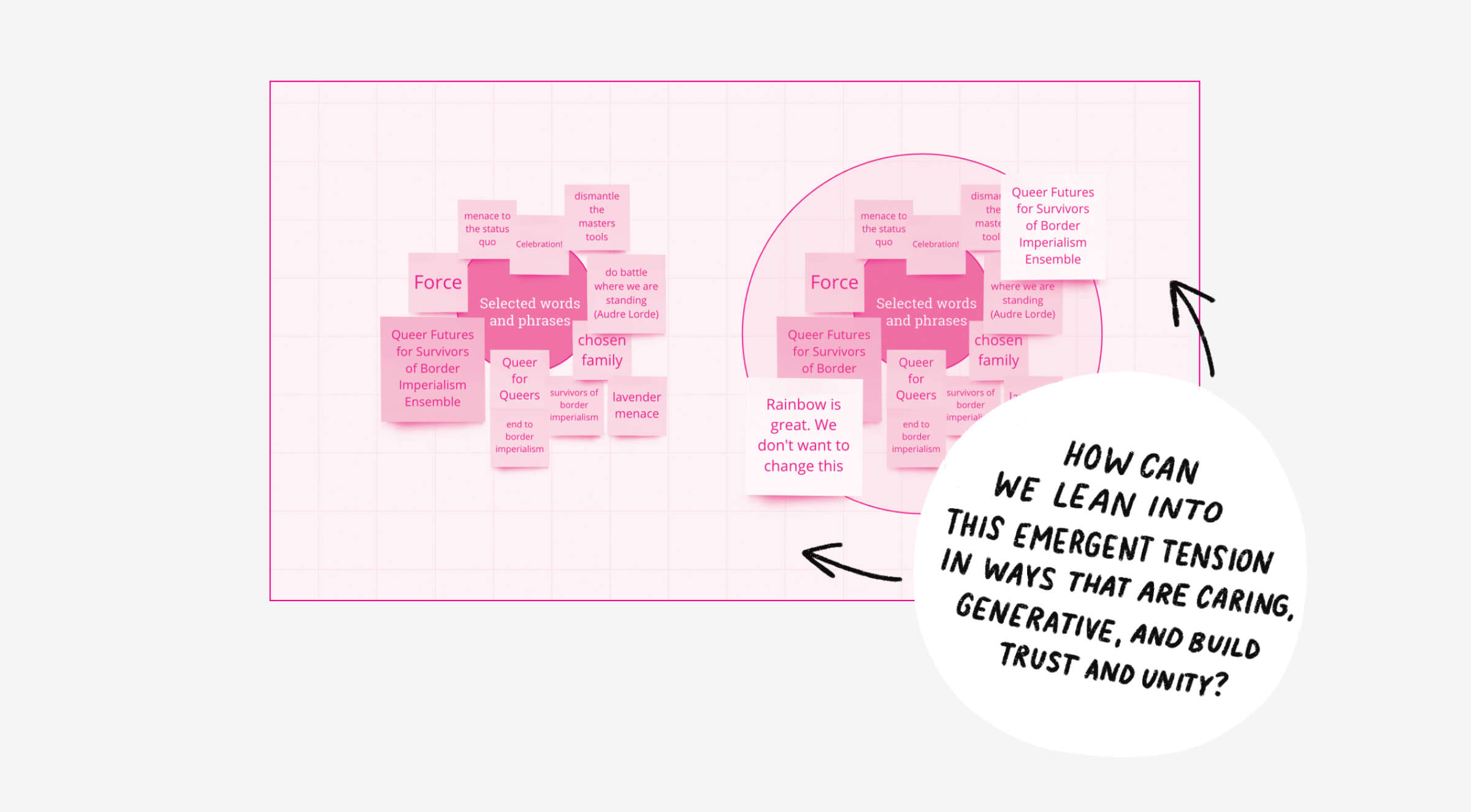
We started by re-capping our chosen and refined framing, Unapologetically Queer, and spoke to how we can communicate that both through the words that we select, and through the tone and structure of the new name. The words? Those are easy. In the process of our brainstorm, someone jokingly and lovingly suggested Queer Futures for Survivors of Border Imperialism Ensemble. But, for the tone/structure, we can think about what it means to move toward something that is more Unapologetically Queer. For us, this means moving from a name that is more literal to something that is more visionary; an attitude and approach that moves from a place of scarcity to one of abundance; and a voice that moves from respectability to authenticity. This conversation ended in a call to lean int to the vision, own our shared values, and to embrace play in this process.
Landing on a name
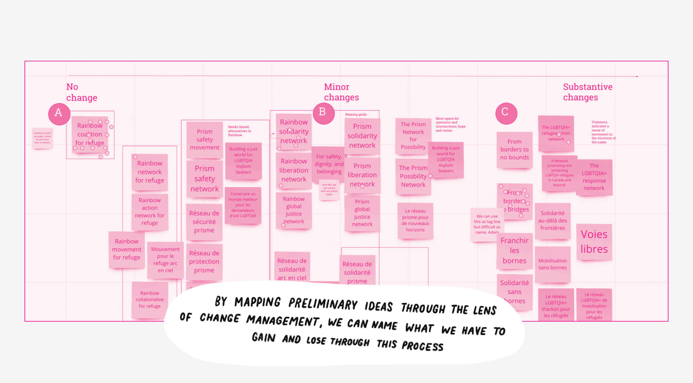
Once we reached a shared understanding, we shared a mapping of some naming possibilities generated by the studio. Acknowledging the challenges of change management, we offered back the original name (Rainbow Coalition for Refuge) on one end (no change), and From Borders to Bridges on the other (with many directions in-between). We reached consensus on a substantive change, and the studio brought back the proposal below which was approved by consensus with the group:

Visualizing the name
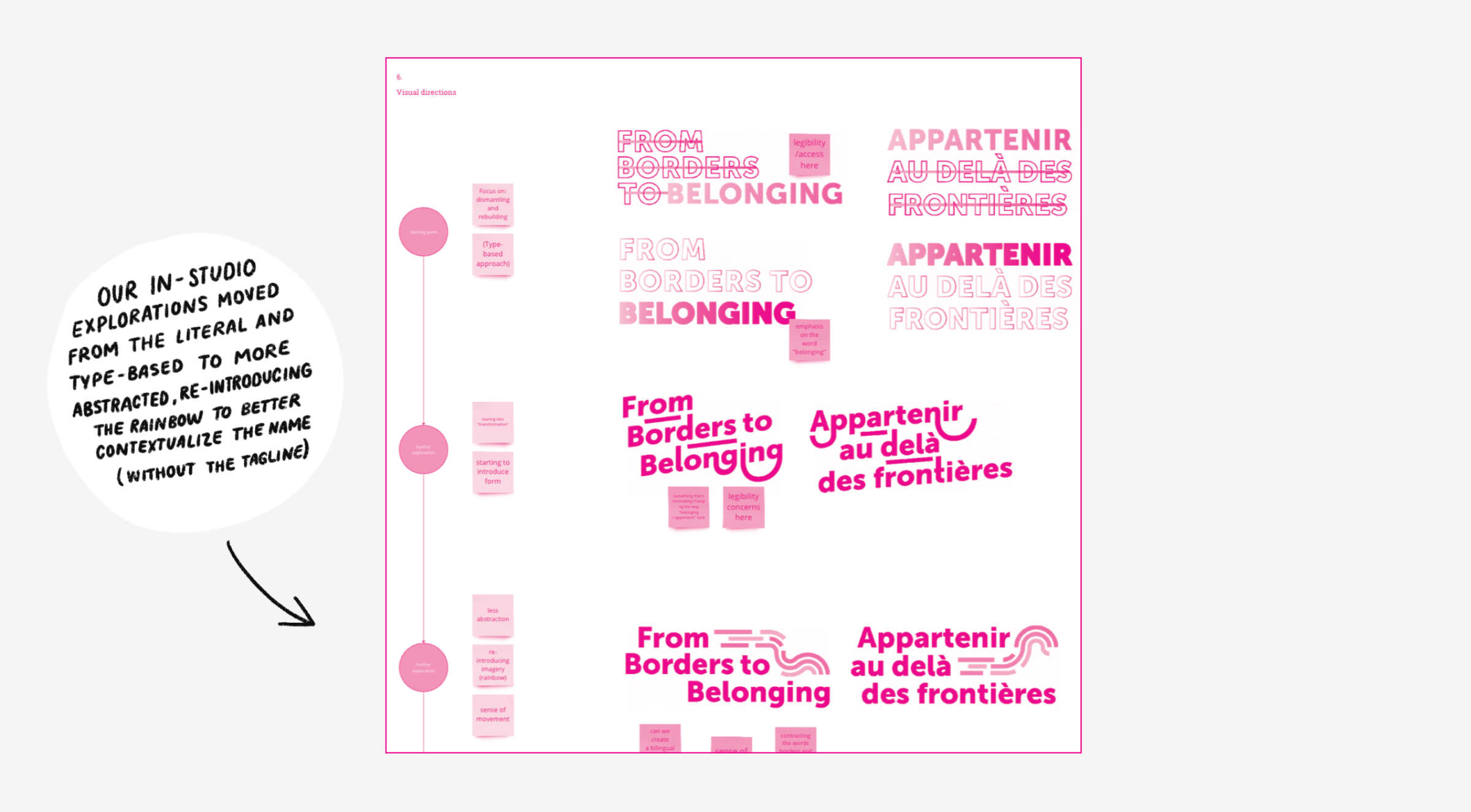
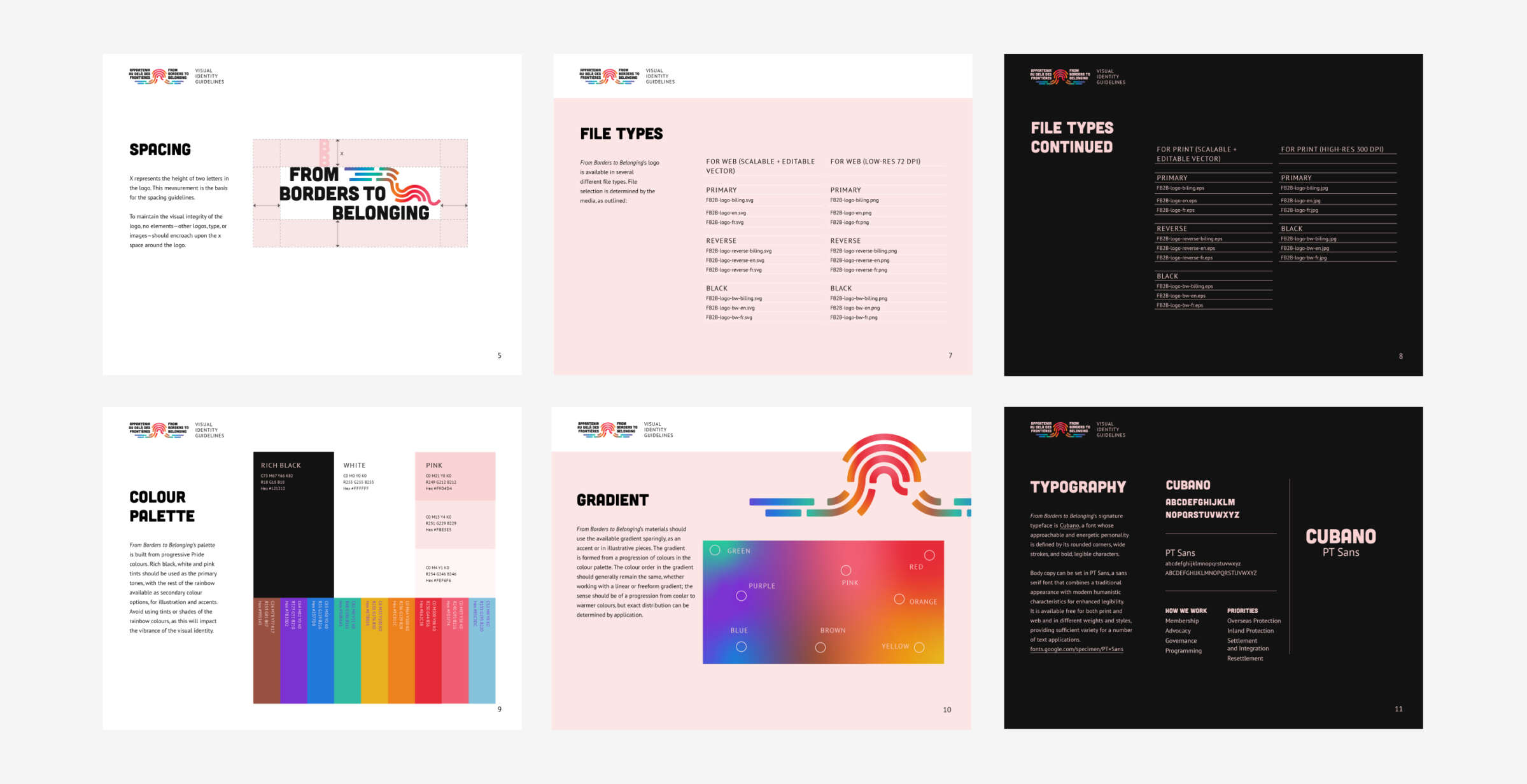
Having built such a strong relationship and sense of understanding with the coalition through the re-naming process, we couldn’t wait to dive into the branding. We started the exploration in-house, focusing on the transformative aspects of the new name, the movement from dismantling (from borders) to rebuilding (to belonging).
Our early explorations took a purely type-baed approach, and played with a strikethrough to support this idea. Concerned with legibility, we pushed this further, bringing in lines that divide, and transforming them to lines that connect. Finally, we developed a sketch that we couldn’t wait to present to the client; reintroducing rainbow imagery (a nod to their previous name and to better support contextualization in the absence of a tagline), and leaning into a strong sense of movement. The group couldn’t wait to explore this more.
Bringing the work to life
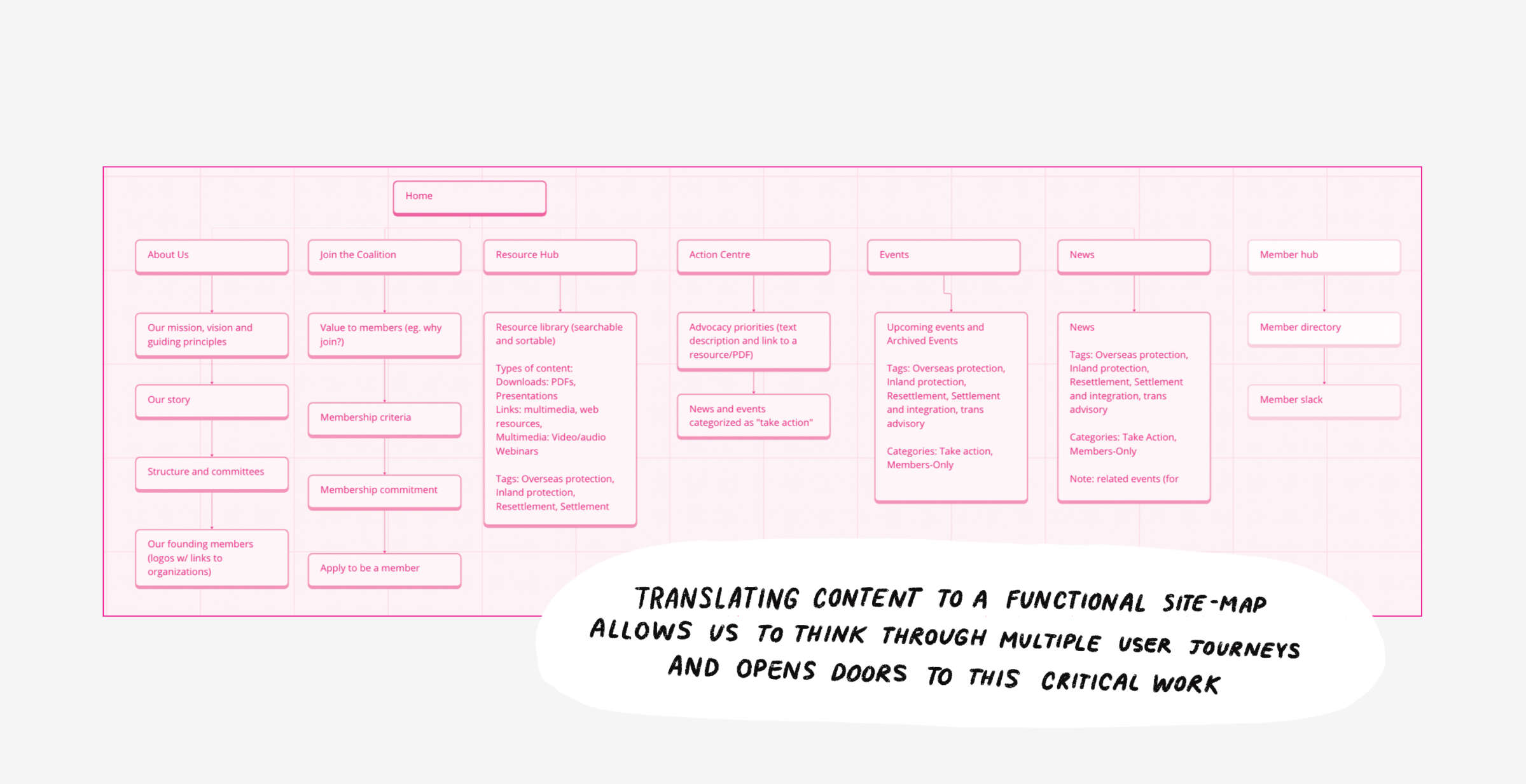
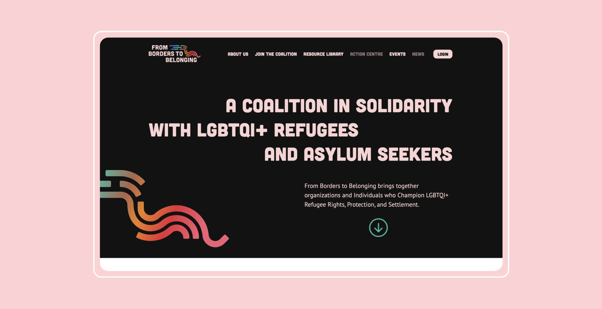
The coalition was almost as excited as we were to bring these ideas to life. Having received unanimous and enthusiastic sign-off on the logo direction, we started to explore colour and other visual elements. We also facilitated a collaborative site-mapping workshop with the group, mapping out the core needs of the future website and proposing back a sitemap for feedback and development.
The Work
The final work, a new name, logo, full brand package and website, speaks to the power of a fulsome process that identifies and names what’s makes an organization unique. The collaborative and iterative process worked at the pace of the group, offered flexibility and creative strategies to build consensus, and reinforced the importance of prioritizing relationship-building (and nourishing) in design processes. The public-facing work not only visualizes the idea of unapologetic transformative frameworks, but is the product of them, too.


How do you want to change the world and how can we help?
Let’s Connect